Rottnest Island
Helping Wadjemup stand out in a sea of sameness
The crown jewel of WA’s tourism portfolio
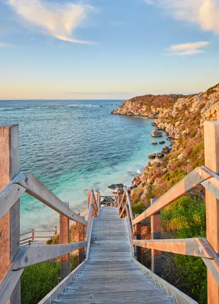
Wadjemup Rottnest Island, Western Australia’s holiday destination of choice just 19km off the Perth coastline, offers a connection to native species and flora, meaningful history, and unique experiences that cannot be found elsewhere.
With the lifting of COVID-19 travel restrictions, it has become imperative for Wadjemup to have a digital presence that attracts both national and international travellers, rather than relying solely on local audiences. The island had undergone a transformation of its brand strategy and technical systems, and needed an updated website experience to keep pace.
Rottnest Island Authority (RIA) engaged equ to create a market-leading destination website that accurately showcases the island's true essence.
Setting clear success measures
The project was an extensive one, covering several critical stages to ensure a successful outcome. The process began with internal requirements gathering and objective setting, where we worked in close collaboration with RIA to identify their needs and establish clear goals and KPI’s for the website.
An intuitive and validated IA
To ensure the website's success, establishing an intuitive and seamless Information Architecture (IA) was crucial. Our strategy team adopted a research-driven approach to develop the IA, which involved conducting interactive card sorting exercises with focus groups and evaluating the existing site structure.
Following this, we conducted quantitative treejack testing, involving a wider range of intrastate, interstate, and international users. This comprehensive testing enabled us to achieve 100% confidence in the IA strategy, ensuring its effective alignment with Rottnest Island's target audiences.
A content-led design approach
Capturing the essence of Wadjemup Rottnest Island on the website was not only a design priority but also a content priority. We ensured that content and design were crafted in unison, with our copywriters collaborating closely with our UX team and the client. Together, we created a vivid and inspiring narrative that perfectly reflects Wadjemup. This narrative was seamlessly woven throughout the site to engage users and motivate them to take action.
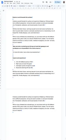
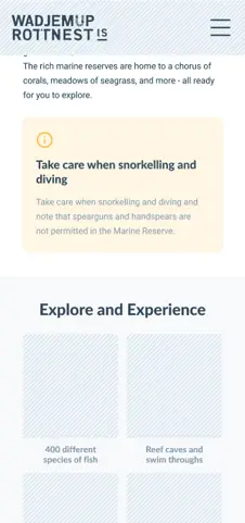
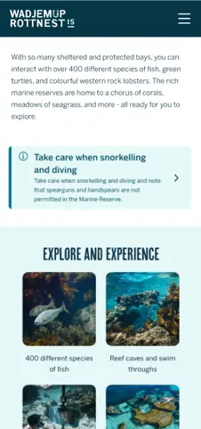

No ‘lorem ipsum’ was used during the design phase - a common but less effective approach. Instead, we seamlessly integrated content with design to ensure complete strategic alignment.
Elevating the story of Wadjemup
A top priority of RIA is to continue their journey of reconciliation and acknowledgement of the island’s past. This included prioritising stories of the rich culture of the Traditional Owners, the Whadjuk Noongar people and the important history of the island with respect and authenticity.
This took shape in the form of a special homepage feature, designed to introduce users to the spiritual and cultural significance of Wadjemup “the place across the water where spirits are”, and encourage them to enjoy the island with reciprocity and respect.
Additionally, the visual identity of Wadjemup was integrated throughout the website content and design, manifesting in background graphics, Noongar translations of native flora and fauna and a strong call to action in the main navigation to encourage users to find out more.
Mapping an island of experiences
Our research revealed the significance of wayfinding and providing indicative distances between experiences when visualising and booking a trip to the island. In response, we developed an interactive mobile-first map designed to serve as a central hub for trip inspiration and planning. The map not only promoted the dispersion of spending across the island but also showcased a wide range of new experiences to both repeat and new visitors.
Users can effortlessly explore various attractions, activities, dining options, accommodations, as well as essential amenities and services available on the island. An intuitive filtering system was designed and thoroughly tested to allow users to navigate the map with ease.

Given the map is central to the website experience and serves as an important tool for trip planning, we undertook extensive user testing to ensure successful implementation.
A calendar of exciting events. Not just a summer destination, it was important to showcase the events and activations happening on the island throughout the year. We developed a visually-led events board, allowing users to filter based on their interests.
Surfacing more than great beaches
An important objective was to provide the island's business stakeholders with a platform to highlight their unique qualities and attractiveness to travellers. To accomplish this, we created a directory and visually captivating listing page for each business, enabling them to showcase videos, images, and essential information to the significant number of visitors who access the site annually.
Customised templates were developed to cater to the distinct service offerings and value propositions of various businesses on the island. For instance, tour operators were provided with a tailored space to showcase the key highlights of their tours and the diverse range of options available to customers.
A headless architecture
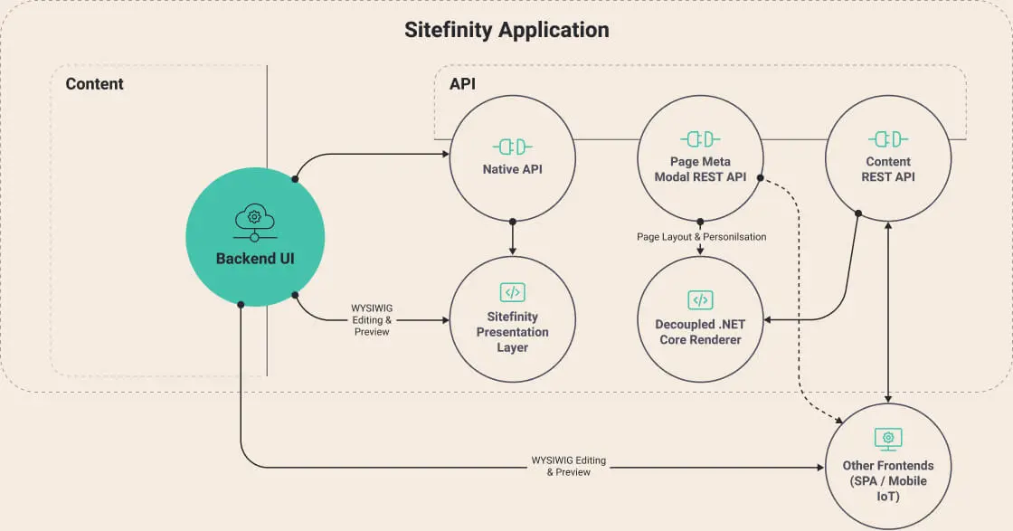
Due to the large size, extensive scale, and enterprise-level requirements of the website, Sitefinity DXP was selected for its robust features and capabilities. To ensure fast scaling and rapid deployment, our system architects implemented Sitefinity .NET Core via its headless technology - a first for Sitefinity in Australia.
The utilisation of .NET Core enabled a decoupled architecture, effectively separating the presentation layer from the content layer. This approach enhanced flexibility and accelerated development processes. Furthermore, it facilitated seamless integration with third-party systems, as the CMS's presentation layer was no longer a dependency. Importantly, this decision ensured the website's future readiness, allowing content to be effortlessly delivered to any future platform or channel.

The Rottnest Island website was the first Sitefinity website in Australia that has implemented .NET Core, a significant milestone for our development team, and the Sitefinity platform itself.
Successfully capturing the island’s essence
Since its launch, the website has delivered exceptional results, evidenced by a remarkable 82% increase in overall traffic. This success is further underscored by a substantial 25% rise in organic search traffic, highlighting the effectiveness of our SEO implementation. Furthermore, bounce rates have decreased by 35%, while session durations have seen a significant 41% increase. These metrics signify that visitors are investing more time in exploring the site, engaging with its content, and planning their visits.
A national award winner
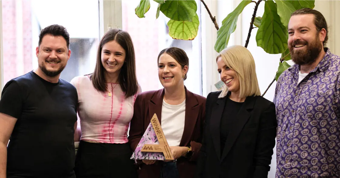
The industry's reception of the website has been overwhelmingly positive, culminating in it being honoured with the "Best Government Website" award at the 2023 Australian Web Award in recognition.

equ’s cross-functional digital product team provided a collaborative and insight-led approach. This delivered a class-leading website that beautifully captures the extraordinary and multifaceted experience of visiting the island.
Next case study


