Using UX design principles to enhance the visualisation of data

Data presented in engaging and attractive ways can help users digest information easily, leading to better user comprehension and engagement.
We live in a world of data. The decisions that affect our lives, both big and small, are all driven by algorithms and mathematical models. And living in this world means that the way we read and interpret data is changing.
Key Takeaways
- Comprehension is improved by using human language, commonly-understood colour elements and web design guidelines
- Creating a focal point and positioning important information in a prominent area make it easier for users to scan
With the confluence of the internet and the real world, it’s now expected that the ways we read this data—most commonly, in a report—are parallel with how we read and navigate on the web.
And living in this world means that the way we read and interpret data is changing. With the confluence of the internet and the real world, it’s now expected that the ways we read this data—most commonly, in a report—are parallel with how we read and navigate on the web.
Businesses are already coming on board with this. Increasingly you’ll see reports of all kinds designed in ways that present their data in engaging, attractive ways, using the principles that we would normally see in user experience (UX) design.
And it makes sense. Using the principles of UX design to enhance the visualisation of your analytics provides readers with an easier way to digest the information. Enhancing the user experience of data-heavy reports improves the user’s understanding of key metrics that are vital to business operations, encouraging more engagement with the content.
Much like UX design for websites, by applying the laws and principles of UX design to the world of data visualisation, we can greatly improve user comprehension, and make it easier to understand how it affects business operations.
Obeying the laws
While there are no hard and fast rules to UX design, there are a number of key usability laws that shape what good design should look like, which should be used as a lens to shape how reports are structured.
It’s all about making the often needlessly-complicated world of data reporting simple to understand.
As the Law of Prägnanz states:
‘People will perceive and interpret ambiguous or complex images as the simplest form(s) possible because it is the interpretation that requires the least cognitive effort of us.'
What this means is that their interpretation of the data will ultimately be the barrier between what you want the user to take away, and what they already know or think about the report. The key to this is making it simple to understand, by assisting the reader in understanding how to interpret the content, removing all ambiguity.
This means using human language, avoiding too much jargon, and working on the assumption that the end-users of your report have minimal knowledge of your analytics. It can be as simple as employing headings and labels that explain exactly what the data is telling us.
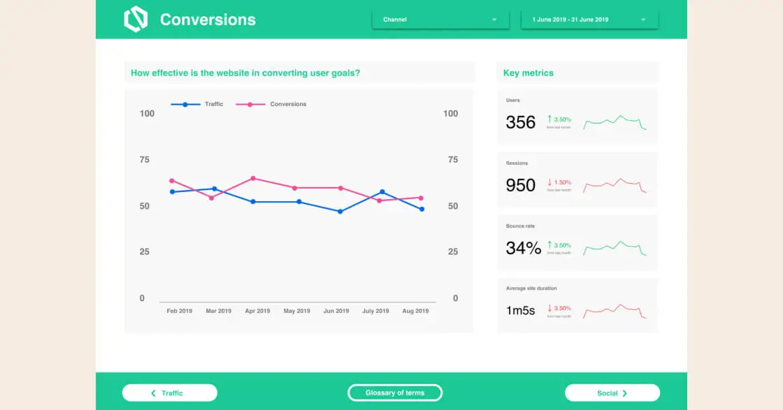
For example, 'Traffic' can be expanded to 'How much traffic is our site getting?'. This makes it absolutely clear what you’re telling them, and what they should take away from the data.
And if you’re unsure even then of your readers’ comprehension, adding a glossary of terms at the front of your report helps users with minimal experience in the field learn the language of your analytics.
As well as language, using commonly-understood colour elements are quick wins for your report. Use green for positive and red for negative. Everyone knows what these colours mean, and makes it even more clear what the data is telling them.
Whether it’s reports or websites, making your meaning clear and unambiguous improves the speed and efficiency in its comprehension. This can also be improved by how readers interact with your reports.
Designed for the internet age
Users expect a level of familiarity across platforms. While creativity is important, the absorption of page content is the primary focus.
And where do people spend most of their time? On the internet. So using web design guidelines to create familiarity with how users navigate your report content improves their comprehension further.
This is Jakob’s Law in action, which states:
‘Users spend their time on other interfaces. This means that users prefer your interface to work the same way as all other interfaces they already know.’
By dividing up each section of the report, presenting your analytics in dashboards, and creating a contents page with navigation links, you’re providing a familiar reading experience that your user already understands.
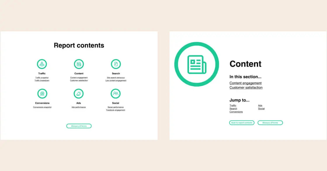
They don’t need to get their head around how to navigate your report, or how to search for the data they’re looking for—they already know. There’s no time wasted understanding its layout.
This speed is critical in maintaining engagement.
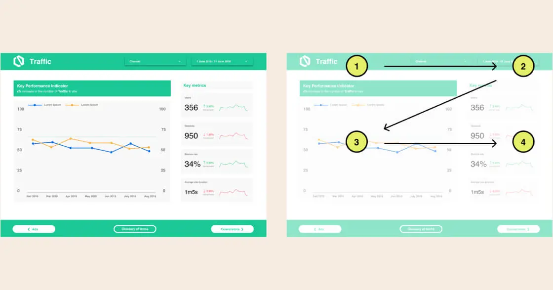
Fitts's law states that ‘The time to acquire a target is a function of the distance to and size of the target.’ Which essentially means the nearer and larger a target is, the easier it is to get to.
So position your key observations and KPIs in a prominent area. Make it quick and easy for users to find the key pieces of information on your page.
Creating a focal point that draws their eye, one that’s interesting and stands out from the rest of the page, forces the user to interact with the report. This focal point is where the key information should be delivered.
After all, people don’t really read content online—they scan.
So reports need to be scannable too, with the crucial pieces of information called out in places where the user’s eye will travel. For example, a 'Z' reading pattern sees the user zig-zagging down the page from the top left, so the content should be positioned in this order.
Grouping data sets together in these prominent places will make it easier to scan your report to find the necessary information, and improve interpretation. Even when there are multiple metrics to display.
But if your content and style don’t follow a unified design, it all falls apart.
Style and substance
Most companies use a style guide these days. They’re crucial in presenting a unified brand personality.
Reports are no different. By applying visual hierarchy and colour schemes, following a unified style and design, users are able to identify and follow patterns that direct them on the path to digesting your data.
But when there’s too much going on within your page, people tend to zone out. They won’t pay attention to the report as a whole, dismissing certain sections, ignoring others.
Too much data is just as bad as not enough. Analysis needs to be summed up in a format that’s easy to break down, without unnecessary noise.
This is Hick’s law in play: ‘The time it takes to make a decision increases with the number and complexity of choices.’
So the more information you have on a page, the more time it takes the user to read and interpret. The harder it is for them to pull out the key pieces of information, the less likely they’ll be to remain engaged with the content.
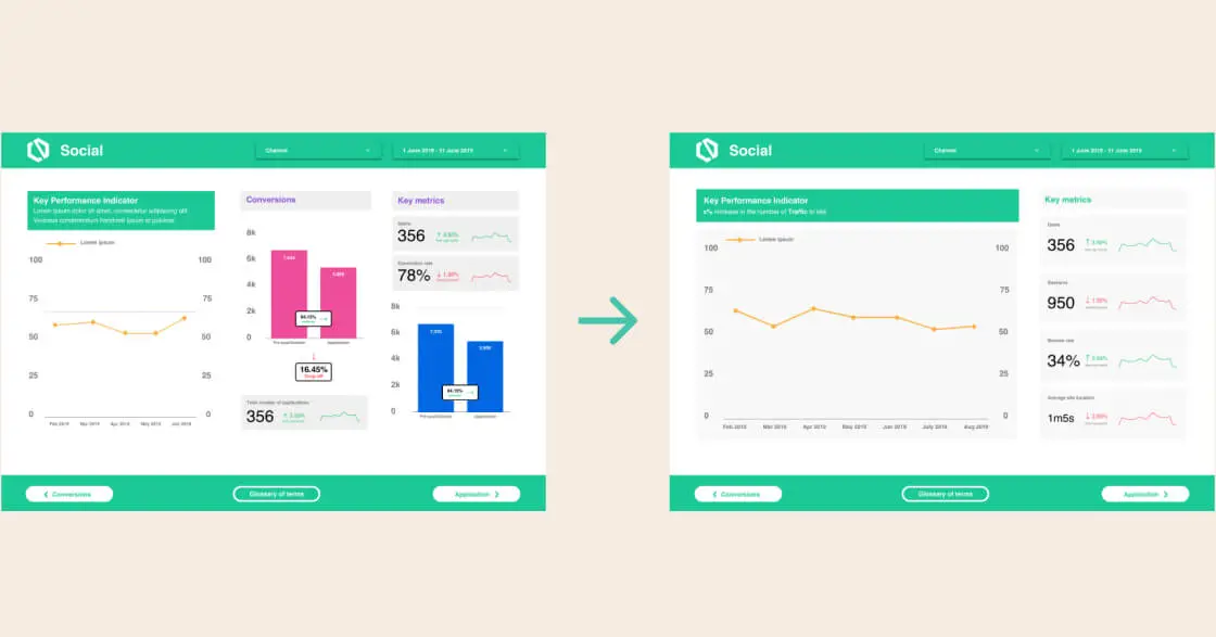
It pays to be smart about what data is presented on a page. If there’s too much content, divide the dashboard into two and provide accompanying descriptions
Tapping in to the trend
It’s a lot to take in, but the ultimate aim of using UX design principles when creating your reports is to make it easy to understand. Deliver an improved understanding of what your data means, and how it relates to business operations.
The challenge we face when creating reports is how to produce a product that’s useful and engaging for every reader.
But using the laws and principles of UX design you can create a balanced understanding of the content and what it means, and by improving UX education for the end-users of a report, we can design dashboards that are as easy as possible for stakeholders to understand and interpret.
When done correctly, this makes your data reports a universal asset. An increased understanding of reports within your business allows more stakeholders to have a knowledgeable input in data-related business decisions.
Familiar navigation pages improve the efficiency of searching through a report to the content most relevant to the user. Improving the content structure of your reports enhances the speed and quality in which users intake data.
And improved understanding of your data leads to better insights. Enhancing business-wide education on key terminology and how to interpret your report allows the user to create their own insights and action them when they arise.
Using the UX principles we follow for everyday design will have a significant improvement in the understanding of data in reports, and make it easier for businesses to interpret data and make decisions.


